SE7EN (1995)
We all know that first impressions are important, right? Well, the same goes for film. The opening title sequence of a film
is its opportunity to make a good first impression on you, the
viewer. A well-crafted title sequence introduces the audience to the
tone and theme of the film as well as the cast and crew.
The opening sequence for Se7en is very well thought out and created. The
whole sequence is a montage of clips and pictures from, what we gather
as the murders, however it could also be the detectives. This instant questioning from the viewer creates the perfect opening to the thriller film. We know
before we watch the film that it is about the 7 deadly sins, so when
watching the sequence, we try to figure out what all the pictures
and words relate to. Of course everything is meaningful which is why
the clips have been used.
The sequence has a creepy, eery feel to it which is very quick paced, giving it a more 'thrilleresque' feel. It is very clear as to what is happening as the sequence integrates what is happening in the film. There isn't a great amount of focus on the narrative, editing is quick and flashy, making the audience confused and disorientated. The flashes of text and image imitate death, relating to the clear genre of the film - a psychological thriller.
The sound is very interesting in the sequence.
It's as if the sound is also a collection of music and soundtracks very
much like the clips. The sound makes a "screeching" noise often, perhaps
to relate to screams of victims. The non-diegetic sound is very scratchy, a sound device which is like a pen scratching, high pitched and painful to the ear. It is fast paced to build tension on the viewer.
The editing is very clever
for the titles and credits. The font is creepy and jagged as if it has
been scratched - this could relate to one of the murder. The titles also fit into the montage which helps with the fluency of the sequence. Typography is glitchy and wonky, adding to confusion and disorientation. Cinematography involves extreme close ups, creating an un clear view. Shots are taken from the villains view so we get a feel for the film. Shots from above show control and dominance. Everything in the sequence is old fashioned, like the photos and books. The setting could be in a basement, or simply a place of study. This gives away the feeling of being trapped.
Overall it is a very powerful opening sequence, able to hold the viewers attention, luring us into anticipation. It is as if the montage relates to the murderer's brain and how it works. We feel that the montage is what's happening in the murderer's mind. It also creates many questions of what is happening and if looked at closely you can see hints of what is to come in the film.
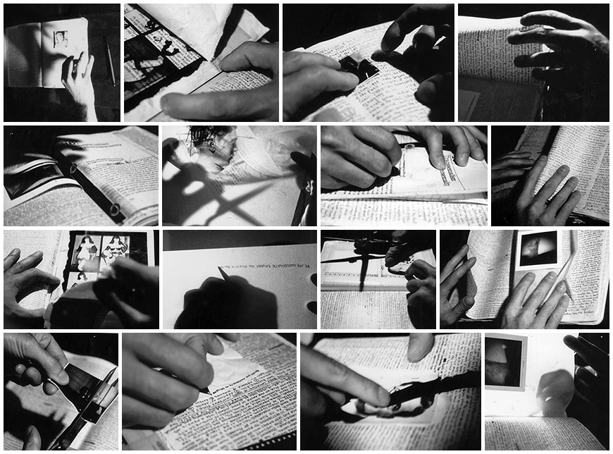 |
| Process photographs |
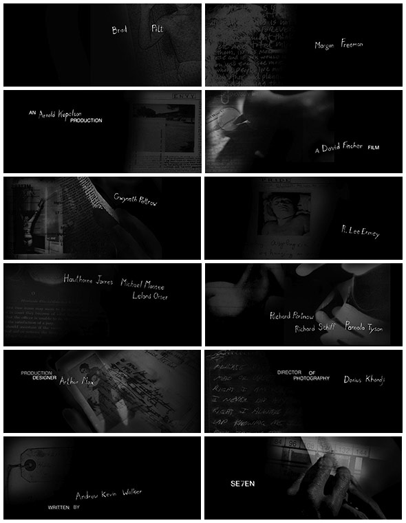 |
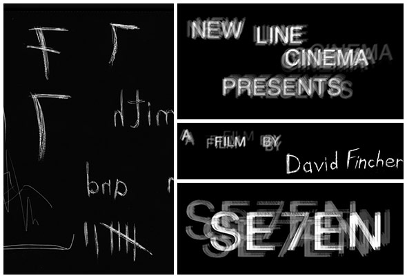
| Opening sequence credits. |
Title designer, Kyle Cooper and his team at R/GA then assembled a glorified slide show of sorts, cutting photographs together with temporary title cards to convey the mood of the sequence.
“We photographed books and shadows and mapped it all out with stills to get an idea of what it would look like when you see through the pages and you see the shadows behind the page and the back light.”
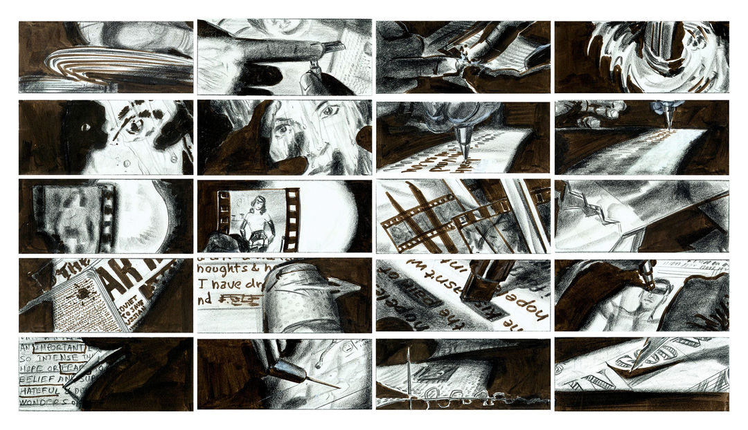 |
| This early sequence was further developed through storyboards by artist Wayne Coe, which were referenced during the live action shoot. |
The typography itself - which would likely break several guild legibility rules in modern times - was hand-etched into black-surface scratch board and manipulated during the film transfer process to further smear and jitter it. This transfer was then cut up and reassembled during post production to add a final layer of temporal distress.
“Fincher and I decided to use hand-drawn mixed with Helvetica, and he was very excited by it,” says Cooper. “He knew that he wanted it to be drawn by hand, because it was from the mind of the killer, and I was taking that further, wanting it to be like the killer did the film opticals himself.”
- All quotes, facts and intellectual information taken from Art of the Title. -
(Timeline completed, yet to be photographed and uploaded on here)
Fantastic interview with Kyle Cooper himself with, 'Anatomy Of An Opening Sequence: David Fincher's Seven'

No comments:
Post a Comment