Monday, 14 January 2013
Initial Ideas
For the opening title sequence our genre will be Horror. This is mainly due to our knowledge and being familiar with the genre. Also there are many aspects and views you can have without using the generic structure of a horror film.
We have had a small think about location, and around Weston there are a few desolate places. They include old, burnt down houses, including the very old Pier, yet also Churches, fields and graveyards. When looking around Yatton I happened to notice the old streetlights they have dotted around. This progressed to possibly having it set in old, dirty 18th Century. Yet of course costumes and hiding cars would be difficult. So I believe it may be a trip to Charity Shops to find old clothes we can 'rag up' to enhance the old dirty feel.
A few films we have been looking at are 'Woman in Black' - mainly due to the setting but the creepy hidden person (I am especially inspired by the scene where we are shown Daniel Radcliffe up against the window and we suddenly see a face appear behind him). Yet also I like the idea of the horror being more subtle and hidden almost, in The Omen.
From the film, The Others, using an idea of an old family photo, or possibly just a young child I'd quite like to print it out in good quality when either having enhanced it and added something to it, or simply just scratching out the eyes. This could also work with a modern day photo, where something has been added in, something like a figure, or a shadow. I also recently watched Sinister and was rather drawn to the idea of freezing an image on a screen, the main character looking away, and the audience seeing the figure moving to look at us.
Stereotypically horror films involve a lot of panning and tracking shots, to emphasise the mood and setting, while including non diegetic sound as a sound bridge to create atmosphere. Also positioning is vital, and usually main characters are placed in the middle of the frame for filming. Their movement can either be frantic and erratic, or slow and calculated, all dependent on the situation.
Thursday, 10 January 2013
Opening Sequence to a Film
SE7EN (1995)
We all know that first impressions are important, right? Well, the same goes for film. The opening title sequence of a film
is its opportunity to make a good first impression on you, the
viewer. A well-crafted title sequence introduces the audience to the
tone and theme of the film as well as the cast and crew.
The opening sequence for Se7en is very well thought out and created. The
whole sequence is a montage of clips and pictures from, what we gather
as the murders, however it could also be the detectives. This instant questioning from the viewer creates the perfect opening to the thriller film. We know
before we watch the film that it is about the 7 deadly sins, so when
watching the sequence, we try to figure out what all the pictures
and words relate to. Of course everything is meaningful which is why
the clips have been used.
The sequence has a creepy, eery feel to it which is very quick paced, giving it a more 'thrilleresque' feel. It is very clear as to what is happening as the sequence integrates what is happening in the film. There isn't a great amount of focus on the narrative, editing is quick and flashy, making the audience confused and disorientated. The flashes of text and image imitate death, relating to the clear genre of the film - a psychological thriller.
The sound is very interesting in the sequence.
It's as if the sound is also a collection of music and soundtracks very
much like the clips. The sound makes a "screeching" noise often, perhaps
to relate to screams of victims. The non-diegetic sound is very scratchy, a sound device which is like a pen scratching, high pitched and painful to the ear. It is fast paced to build tension on the viewer.
The editing is very clever
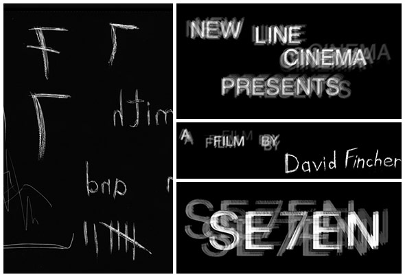
for the titles and credits. The font is creepy and jagged as if it has
been scratched - this could relate to one of the murder. The titles also fit into the montage which helps with the fluency of the sequence. Typography is glitchy and wonky, adding to confusion and disorientation. Cinematography involves extreme close ups, creating an un clear view. Shots are taken from the villains view so we get a feel for the film. Shots from above show control and dominance. Everything in the sequence is old fashioned, like the photos and books. The setting could be in a basement, or simply a place of study. This gives away the feeling of being trapped.
Overall it is a very powerful opening sequence, able to hold the viewers attention, luring us into anticipation. It is as if the montage relates to the murderer's brain and how it works. We feel that the montage is what's happening in the murderer's mind. It also creates many questions of what is happening and if looked at closely you can see hints of what is to come in the film.
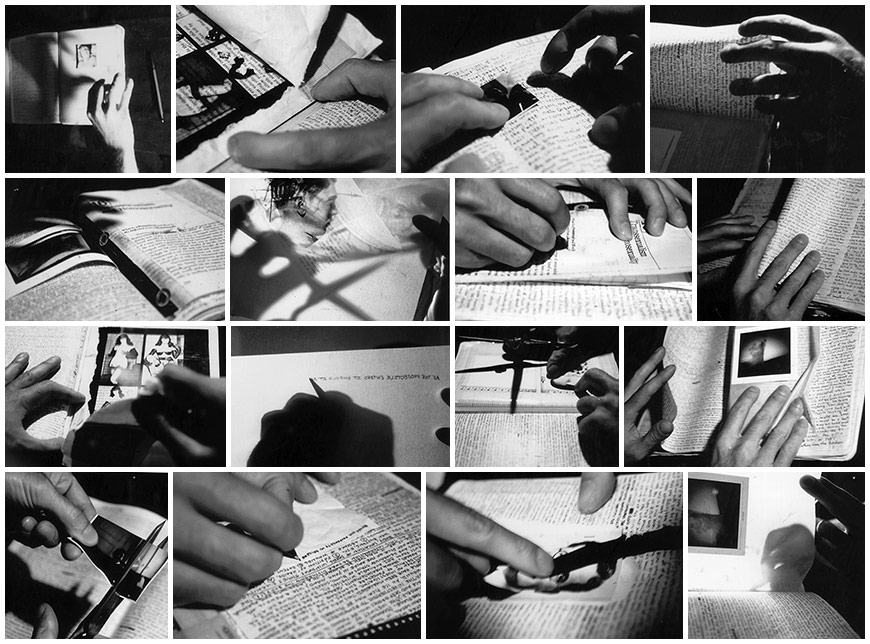 |
| Process photographs |
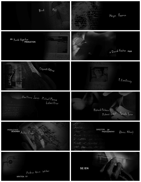 |
| Opening sequence credits. |
Title designer, Kyle Cooper and his team at R/GA then assembled a glorified slide show of sorts, cutting photographs together with temporary title cards to convey the mood of the sequence.
“We photographed books and shadows and mapped it all out with stills to get an idea of what it would look like when you see through the pages and you see the shadows behind the page and the back light.”
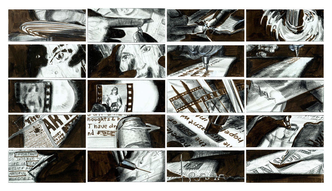 |
| This early sequence was further developed through storyboards by artist Wayne Coe, which were referenced during the live action shoot. |
The typography itself - which would likely break several guild legibility rules in modern times - was hand-etched into black-surface scratch board and manipulated during the film transfer process to further smear and jitter it. This transfer was then cut up and reassembled during post production to add a final layer of temporal distress.
“Fincher and I decided to use hand-drawn mixed with Helvetica, and he was very excited by it,” says Cooper. “He knew that he wanted it to be drawn by hand, because it was from the mind of the killer, and I was taking that further, wanting it to be like the killer did the film opticals himself.”
- All quotes, facts and intellectual information taken from Art of the Title. -
(Timeline completed, yet to be photographed and uploaded on here)
Fantastic interview with Kyle Cooper himself with, 'Anatomy Of An Opening Sequence: David Fincher's Seven'

My Ident
All films whether independent or from The Big 6 use an ident. A short animation, some music and often text is used to show the audience the production company, before the opening title to the film. Idents from the Big 6 are usually grander, with more statement to enhance the fact it is a larger distribution company. Although independent companies can create just as good idents, maybe in a more subtle way usually because of their budget.
In contrast, here is the ident for a considerably smaller, not so well known ident, Bad Robot, an American film and television production company owned by J. J. Abrams and Bryan Burk. Although having taken ages to plan, prepare, design and construct, it is only 2 seconds long and features little sound. Simplistic sound creates a subtle effect yet it is still a great ident. At the end, a group of children say the name of the company after hearing scurrying as the robot nears us.
After having a play around with the some of the effects I found the Splash Ink effect, I edited and put together each scene I sorted the timings for the music. Of course it wasn't long enough so I had to copy it, cut it perfectly and using the correct tools had to make it fit perfectly so it flowed and anyone would think it were one piece.

In my ident I wanted the name of the production company to follow the short clip of footage. By doing it this way the production company name is the last and most memorable thing the audience will see. Also the short animation before will stick in people's minds so that they can put both the footage and the name together. I wanted to keep the whole ident simple so I decided on just having the company name at the end, in the same font. Below is my completed ident;
Wednesday, 12 December 2012
Subscribe to:
Posts (Atom)